“Next” Design System
Building a new system of modular, scalable components with strong accessibility and interaction standards in close partnership with engineering and alignment with product strategy.
The challenge
When designing for a frontline training platform, we began to scale quickly and our design system wasn’t keeping pace.
For engineers, making changes meant navigating years of legacy code. For designers, it meant working around inconsistent components and hard-coded values that didn't respect the system we were trying to maintain. The gap between design intent and what shipped was real and felt deeply, especially compounded over time. Feedback from customers and deals we lost told us our UX looked dated.
The turning point came when we decided to redesign our platform's homepage, which made it clear we couldn't just patch the old system. It was time to build something new, which we aptly named the “Next” Design System.
PROPOSED SOLUTION
The goal is a fully documented system that works seamlessly for designers in Figma, for developers in code, and is built for the way teams are starting to work with AI. We're working toward integration with tools like Cursor and Claude so that the transition from design to code is fast and reliable, and changes are simple.
THE IMPACT
A design system for the frontline, built for the future of how we build.
HOW’D WE GET HERE?
The approach
As the primary designer on this work, I serve as the central point of accountability for the system: guiding decisions, supporting teammates who contribute across design and dev, and ensuring the system evolves with intention.
01 — Audit
I started with an audit of the legacy system that revealed what areas needed the most attention, while benchmarking against modern patterns to help define where we needed to go.
02 — Foundation
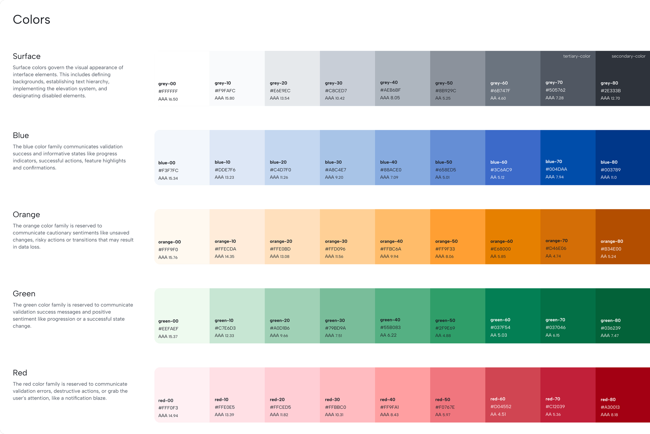
From there, I began creating the foundational design principles, tokens and variables as the building blocks that everything else grows from. I stayed close to our brand to make sure the new system felt familiar, just a better, more considered and modernized version.
03 — Building
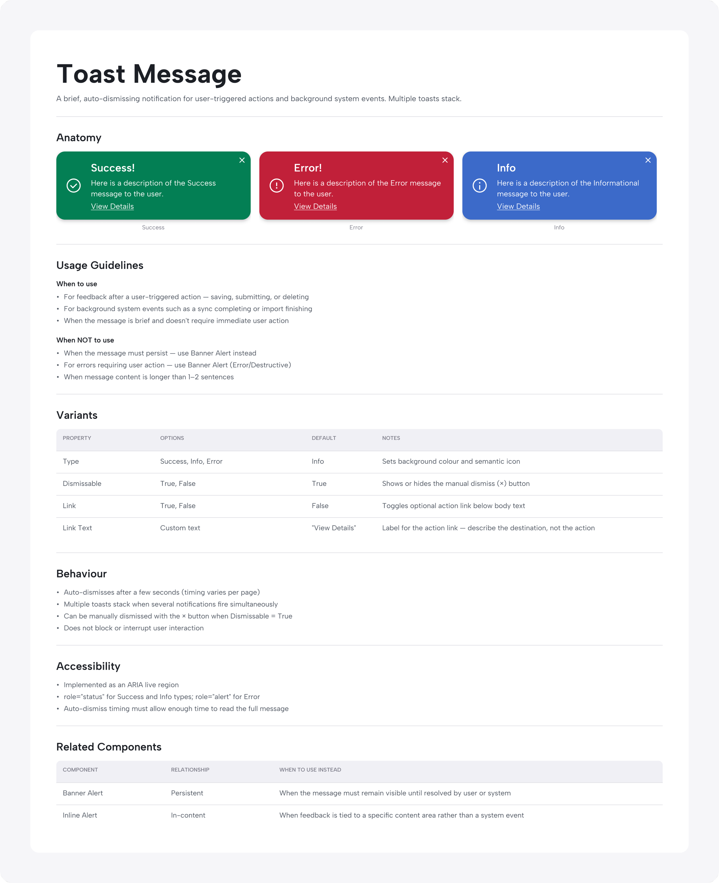
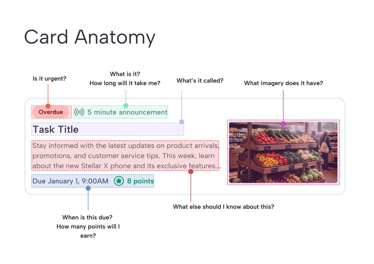
I’m currently defining through all new components for the system. I work closely with our UX developer, managing components together from early ideation through to ready-for-dev state with regular syncs and a shared workflow across Figma and Storybook.
WHAT’S NEXT
Looking ahead, my focus is spread across three main areas:
01
Defining more components and fleshing out the library so it's ready to support a broader set of product experiences
02
Structuring documentation: how it lives in Figma for designers, surfaces in Storybook for developers, and creating a clear, consistent usage process across both
03
Discovery and laying the groundwork for AI integration by exploring how the system can be built in a way that supports AI-first workflows and tools like Cursor and Claude Code
RESULTS AND REFLECTIONS
Where we are now
Many of the core design system styles and variables are already in use across the product and component and pattern libraries are actively taking shape. Teams are consuming what's ready, giving feedback, and waiting on what's next which means the system is already doing its job of creating alignment even before it's complete.
With the new UX launching in Q3 starting with the homepage and expanding from there, the goal is to have a much more defined, well-documented system with enough components ready for dev use to support the rollout with confidence.
The early signals are encouraging: positive reception of the new design direction, easier demo experiences for our sales team, and faster, more efficient implementation on the engineering side. We're modernizing both our codebase and our design workflows at the same time.